Talking Points Aren't Always Wrong and Theories Should Be Proven
It’s been a long couple of weeks. We’re going through COVID surges in the southern border states that seem to (hopefully) be winding down, schools are refusing to open, protests are intensifying, and Disney World is open even as Florida suffers one of the harshest surges in the country.
Fortunately for me, I have no opinions about any of that for the purpose of this newsletter, you have to come by my place for a socially distanced drink to get the full story on all of that…
For today:
Case Surges or Testing Surges
Evolution of a Theory
Disney Shorts: Goofy and Wilbur
Case Surges or Testing Surges?
It’s been hard to find consistent, coherent talking points in this crisis. Early on, I kept saying that things were unpredictable because they were. Given almost any talking point or theory that seemed to match a small set of data, there was a compelling counter-example that included some missing data points that completely invalidated the theory.
I thought of this of this as I was saw someone mocking the idea that was circulating early that case increases were due to testing increases. I went back to examine that concept (I suggested it as a possibility for North Carolina’s surge back in early June).
I want to separate out a couple thoughts here. First, there are the people who are looking for a reason to not be concerned about a case surge. They might see “cases will surge if there is a surge in testing” as a convenient excuse. I want to caution against that view. Case increases should be taken seriously until they are conclusively proven to be the result of testing increases.
It could very well be that some people, frustrated with this cheap deflection, feel that is is appropriate to mock it in light of the genuine and concerning surges in the southern border states.
But that doesn’t make this idea of testing increases driving case increases wrong… at least not in every case.
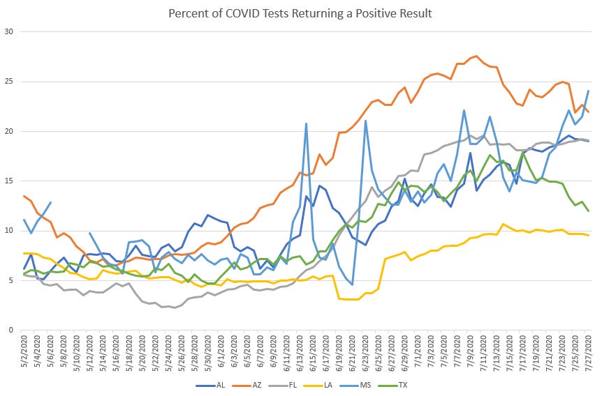
Let’s look at some states that saw genuine surges. We’ll take a peek at cases from Arizona, Texas, Louisiana, Alabama, Mississippi, and Florida.
We can see the case surges pretty starkly through June.

But is the is result of increased testing? Or is it due to a genuine surge? The easiest way to check this is to look at the percent of cases coming back positive.
The way to check this is to see if the percentage of tests returning positive is increasing. As a very general rule-of-thumb, if more than 10% of tests are positive, that’s not good. Over 20% is something that we should be *very* worried about. Under 10% positive gives us room for hope. Under 5% is very encouraging.
If we’re just testing more, this positive percent shouldn’t rise. But in these states, we can see that it does rise and ends up rising the most in the states that we were the most worried about.

So we get case increases as our first indicator and then that is reinforced as we look at the case positivity, which is also rising.
OK, this is valuable information. So let’s apply it to some other states. Let’s look at other states with concerning case increases.

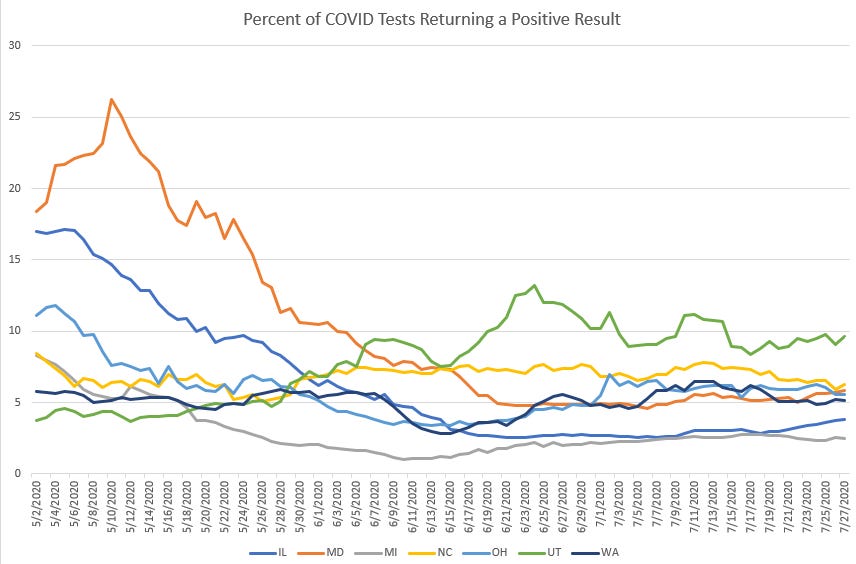
We can see here that Utah and North Carolina have seen very concerning case increases and we have several other states that look dangerously like the early stages of our current surges. At first glance, this is worrying
But let’s double-check this against these states’ case positivity.

We see very quickly that the case positivity for all these states is essentially flat for the last 6 weeks. That means the case increases we’ve seen in that time are mostly due to higher testing, not to a surge in cases in the general population.
To be clear, this isn’t a reason to lower our guard in combating the virus. It is simply to note that the “case increases could be due to testing increases” is in fact a true thing. It’s true, but it is not always true. We need to check our assertions against other metrics in order to make these kinds of statements with confidence.
The Evolution of a Theory
I’ve been pretty skeptical about explanatory theories that just happen to match whatever pattern we have most recently seen in the data, so I wanted to walk through my thinking when I am developing a theory. I want to talk about how I formulate a theory, how I research a theory, and when I develop enough confidence to start talking about a theory.
I was perusing the CDC Excess Deaths dataset for reasons that would completely derail this story to explain when I came across a metric the CDC maintains called “Number of Deaths Above Average”. This looks at the number of deaths above average related to various causes of death. And the scale of the Alzheimer and dementia deaths startled me.

We know that COVID is a disease primarily of the blood that can cause respiratory distress and yet dementia deaths are almost equal to the over-death related to all circulatory diseases combined. That seems weird.
My first reaction was to assume that Alzheimer and dementia deaths (I’m going to call them AD from now on) are just a proxy for age and we know COVID is particularly dangerous to the elderly so I assumed that this is largely COVID cases in AD patients.
But then I looked at state-by-state data.
I’m going to show Hawaii because that is where this pattern is the most stark. Hawaii has had 109 dementia deaths over average since February. Hawaii has only only had 26 COVID deaths.

That’s very very strange. These are not simply hidden COVID deaths. Five of the 10 least-hit states for COVID have more AD excess deaths than COVID deaths. Something else is happening.
My first stop is to check the NIH to see if there are any papers on AD deaths and COVID. Outside of some boilerplate papers on protecting nursing home residents from COVID, there wasn’t anything that would indicate a pattern that I could follow.
I asked the same question on Twitter, which is a pretty hit-and-miss place for reliable information and got back a number of responses, both public and private, indicating that many AD patients have deteriorated as they have been divorced from their family members and routines in an effort to protect them from the virus. Several people have reported that their parents have suffered severe deterioration in mental well being and morale due to the breakdown in consistent routine care and social activities.
That’s as far as I’ve gotten with this. My working theory is that AD patients need more than protection against the virus, they need the routine and family interaction to remain healthy.
That’s my theory, but you won’t hear me talking about it on Twitter because things on Twitter take off, divorced of caution or context. I trust that people reading a long-form piece will understand that this theory is light-years from being proven. It’s a guess, an extrapolation of some extremely weird data and some quiet conversations. That’s not enough evidence to say anything is definitely happening.
I try very hard to make sure I’m not spreading disinformation or convincing people of things I myself am not convinced of. The starkness of the AD death data is startling to me and I will be watching it closely. And I’ll certainly bring it back up in this format if there is an alternative explanation that sheds more light.
Disney Short: Goofy and Wilbur

I’m somewhat disappointed that this didn’t turn into more of a long-term team-up. Pairing Goofy the lovable dunce with Wilbur the clever grasshopper makes for a delightful contrast.
In this short, Goofy goes fishing and brings along his buddy Wilbur the Grasshopper to help lure the fish into his net. The joke, of course, is that the voice of Goofy was first featured as the grasshopper in the short “The Grasshopper and the Ants”, so there is some irony to this match-up.
The funny part to me is that we get halfway into the short and Wilbur almost dies in the jaws of a street-wise fish. Instead of this serving as a warning to our duo, Wilbur leaps deeper into danger and Goofy spends the latter half of the short trying to retrieve his friend.
All this would be overly absurd and silly were it not for the tender moment at the end in which Goofy’s tears of sorrow resurrect Wilbur. It’s very silly and… well… goofy. But it’s cute and fun and it’s our introduction to Goofy as a leading character.


Here in Oklahoma, our ability to draw trend conclusions is really hampered by haphazard data collection, and I suspect that more states are in the same boat. There has been a pronounced flattening over the last 11 days in the low nines on positive rate, which likely correlates with mask mandates being implemented in the 3 largest cities in the state (looking into that more later this week if the trend holds). We are testing more than ever--yesterday we reported results on over 20K tests, our highest single day so far, and we have seen the raw case counts jump in response to the higher testing while the positive rate moving average has held fairly steady. If we can bend that number down towards the 5 range, we'll all feel a tiny bit better about schools reopening, I think. Some districts are delaying in class attendance for the 9 weeks in the hopes that the situation will improve.
With regards to 'case surges or testing surges?', there is also a need to think over multiple time scales. One can be in the middle of a case surge that is beyond an expansion in testing (Florida in late June into July) and still have day-day variations that are explainable through the variation in the number of tests results that came back on a given day. Example being the Sunday report a couple of weeks ago that showed 15,000+ cases. There were plenty of "ZOMG FLORIDA IS ACCELERATING OUT OF CONTROL TAKES" that didn't take into consideration that there were a massive number of test results as well. Some people try to uniformly impose the 'case surge or testing surge' judgement uniformly and end up with incorrect conclusions.
FWIW, local news, which I do not consistently monitor (but happened to see on the Sunday in question) does seem to have since gotten better with providing more context (in terms of giving the positive% as well as the raw number of cases). There is, of course, more context than can fit into a headline/news alert, alas.