
Only The Best Experts

It is still pretty crazy to me exactly how much is happening week to week. I may have to do another round of this newsletter this week as I try to sort through more COVID data. I’m skipping my weekly assessment for now because there is just too much other stuff going on.
Also, if you are not yet a paid subscriber, the kick-off special ends this week so make sure you sign up to get all the issues of Marginally Compelling.
In this issue:
How Can We Trust Experts?
How To Recognize a Surge
ICU Utilization Actually *Is* Magic (For Good Hospitals)
Reopening Phase 1.3.13 (Release Candidate)
Disney Shorts: Mr Mouse Takes a Trip (and Get a Horse)
How Can We Trust Experts?
Over the last few months, I’ve spent an enormous amount of time talking to experts. I’ve spoken with experts in supply chains, manufacturing, epidemiology, virology, finance, medical coding, and data architecture. I’ve talked to doctors, researchers, and down-in-the-dirt professionals. I have discovered so much about so many things.
Watching the trust in public health experts evaporate over this last week has been an absolute horror show. Starting with the absurd Google document claiming to be a letter from a thousand public health experts an moving to a Johns Hopkins epidemiologist and a former CDC director, the act of issuing public health exceptions for the ongoing protests has terribly damaged the credibility of the “public health expert”.

pictured: the credibility of a generic public health expert
The crazy thing for me is that none of the experts I know are doing this. They are all saying the exact same things they have been saying before. Once ubiquitous in the public consciousness, Dr Fauci has all but disappeared from view, even while he has been begging protesters to scale back their events.
The CDC director has been waving his arms over his head, begging protesters to get tested. My go-to expert for viral evolution did a back-of-the-napkin guestimate of the impact of the protests on COVID infection. He expects protest-related cases to start showing up this week. He stresses the enormous range of uncertainty, but expects the protests to result in 10-100 daily COVID deaths within a few week.
This sentiment is mirrored by my go-to virologist, who says he is “almost certain” that we will start seeing a reversal in hopeful COVID trends. And the same from Nicholas Christakis, Yale professor and medical doctor.
This list goes on and on and on. The people I have been following and trusting for detailed COVID information are almost all on the same page about this. They support the cause behind the protests but want to make sure no one is under the illusion that these protests are safe from the COVID threat.
And while all these experts have been consistent on this from day one and remain so. I’ve noticed that the experts who are giving the contradictory pronouncements are new to me.
It seems there are two ways an expert can make his or her voice heard. The first is a lifetime of dedicated apolitical work building bridges, doing research, making hard choices and discovering new ways to help people. This is the Dr Fauci path. The other way is to say something that lights Twitter on fire and gets picked up in the media.
I don’t know that credibility with the general public can be repaired. Certainly not in the next few months, when it is most needed. The best thing we can do is find the experts we trust and then trust them. Follow them closely, even when no one else does. Pick them because they educate you, not because they agree with you. That is how we can trust experts and inoculate ourselves from bad information.
Interpreting a Surge
So it seems likely we will see a COVID surge. Let’s talk about what a surge looks like and how to spot it.
The number one rule is to *never* trust a one-day surge in almost any metric. I had heard about rising hospitalizations in Georgia as a warning sign. And then I saw that Kelley Krohnert (who runs http://covid-georgia.com) had charted exactly how the reports of hospitalization were coming in.
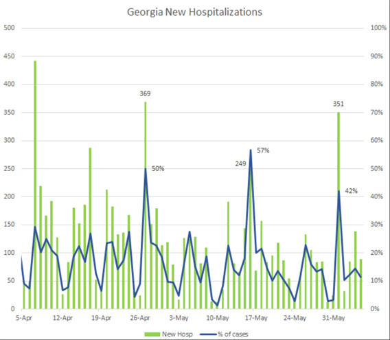
This makes it slightly more clear. What was being reported as a surge was really just a surge of reports. Either through chance or through some systematic problem in the reporting process, hospitals seem to be sending case and hospitalization reports in batches instead of every day. It looks like a surge, but it’s actually just a data refresh.
This happens a lot for almost every metric. Even now, even in New York, we can clearly see the weekends (when county health departments are less likely to send in new case reports) plainly in the data.
If and when we see COVID surges, they will start with uncertainty. We will see a day, maybe two, of higher data. But we can’t jump to conclusions. A real surge is likely to see an increase across all metrics (cases, hospitalizations, deaths) over a sustained amount of time.
My personal advice is be aware of your own county’s COVID numbers and use your own judgement and caution. We are in a better spot to fight this than we were 3 months ago, but it doesn’t hurt to keep an eye on the numbers in the places most important to you.
ICU Utilization Actually *Is* Magic (For Good Hospitals)
I’m almost giddy to talk about hospital utilization because I learned something this week and now you have to learn it too.
When this crisis first started, I believed that the real battle would be trying to make enough room in hospitals for the crush of COVID patients. I was incredibly surprised to discover in early April that New Jersey has bed utilization rates at 60%-80% even though New Jersey was seeing a lot of cases. Could that be right? As always, we have to lean on our old data question “Compared to what"?” What are normal bed utilization rates?

Is high ICU utilization a worrying trend?
Well… yes and no. But definitely more “no” than “yes”.
To understand this, we have to back up a lot and realize that typical ICU room utilization is almost always over 70%. ICU utilization can frequently reach 80%-90% without cause for worry. My concern with the graphic above is that it doesn’t even begin to recognize that +70% utilization is actually very normal for most hospitals.
In fact, ICU utilization under 70% could be more indicative of a COVID surge because it could mean that hospitals have cancelled their normal operations to prepare for a rush of COVID patients.

pictured: Me looking for an excuse to use a Scrubs gif
As I looked around for a little more context on this, I talked with someone who had a great deal of an inside look at how hospitals manage their capacity. Since the beginning of the COVID crisis, many hospitals have been running at such low capacity that they’ve been losing billions of dollars, to the point of massive staff furloughs. Now, as things begin to return to normal, hospitals are trying to maximize their resources while keeping one eye on the possibility of a COVID resurgence.
To do this, many hospitals are relying on the kind of problems that data science was born to solve. What hospital utilization brings in the most profit? Operating rooms, which are so expensive to run they often bill out at a per-minute basis. How can we get as many procedures in and out of operating rooms as possible? There are enormous amounts of data about what kinds of procedures have what risk of complication and how long they take with variables around patient age, health status, comorbidities, etc, etc.
Counter-intuitively, the better a hospital can manage the flow of care, the more likely they are to have *high* ICU usage. The Mayo Clinic has superb care and *aims* for 90% ICU bed management. That means they’re not wasting beds, they are accurately predicting complications, they are ready to care for people when they need the care, they aren’t wasting resources.
Yes, they want some space for unexpected surges and emergencies, but if there is a genuine COVID surge, it’s likely the hospital will simply cancel elective procedures to quickly make space. That and the fact that we now have a LOT more experience at converting non-ICU beds to an ICU status means that it’s enormously ignorant to assume that a state at 70% ICU capacity is showing signs of trouble. Even 90% ICU capacity isn’t unreasonable for a well run hospital.
So, yes, keep an eye on ICU capacity. But also keep in mind that it is something that hospitals are watching much closer than you are. COVID can move fast, but there are a lot of smart and innovative people on this problem and no single metric is going to give us magical insight that is hidden from everyone else.
Reopening Phase 1.3.13 (Release Candidate)
In case you don’t get it, the title here is a joke about software releases. In software development, we often end up with deadlines we can’t hit but no one wants to admit that we didn’t hit the deadlines so we increment the best we have up one version and push it into the next stage, which might be an alpha or beta, a release candidate or a production build. Moving from one stage to another *should* have substantial meaning but often ends up being a signal that we need to show progress in moving from one stage to another.
So it is with Washingon state’s phased re-openings. Instead of recognizing that our initial metrics for moving between phases might not have been well thought out as the shift to Phase 2 has stalled in several counties, Governor Inslee decided to create an entirely new phase (Phase 1.5) for counties that don’t qualify for the strict conditions of Phase 2 reopening.
I’m closely watching Washington’s re-opening plan and am somewhat gratified that they have made some changes since I criticized it 11 days ago (time no longer has any meaning). Specifically, they’ve changed the requirement from under 10 cases per 100,000 to under 25 cases per 100,000, which was a good move.
But the differences between Phase 1.5 and Phase 2 are almost absurd. In Phase 1.5, construction, manufacturing, photography, and house cleaning can move to Phase 2. “Gatherings” must be fewer than 5 people unless it is a protest in which case it can be up to as many people as show up. Buildings are limited to 25% capacity with “indoor services” limited to 30 minutes unless you are a retail business in which case you have to be at 15% capacity.
What is stunning is the capricious nature of all of this. There does not seem to be a guiding light or an attempt to re-visit previous assumptions. It’s just “find a number in between Phase 1 and Phase 2 and put it in a PDF. Apply it to only some of the restrictions.” I would not be surprised if Phase 1.5 was designed by putting a group of 10 people in a room and having them raise their hands while numbers are rattled off. That’s how coherent this feels.
I don’t know what is going to happen other than a soft revolt. Restaurants and businesses simply deciding to quietly allow more people than they technically are allowed and just hope no one notices. I wrote about soft revolt earlier in the battle over the playgrounds (which aren’t supposed to open until Phase 3) and, without writing another 800 words on it, I can simply report that *everyone* has given up on the rules about playgrounds to the point where the children themselves are treating caution tape like another plaything.

Disney Shorts: Mr Mouse Takes a Trip
Speaking of ignoring the authorities and breaking the rules, let’s watch Mr Mouse Takes a Trip. This 1940 cartoon is sadly toward the end of the era of great Mickey Mouse shorts. As the Donald and Goofy shorts took off and Walt Disney started setting his sights beyond the realm of animated shorts, there were fewer and fewer Mickey shorts. Walt has always supplied the voice for Mickey Mouse and his increasingly busy schedule left less and less time for voice acting.

Mr Mouse Takes a Trip has Mickey and Pluto trying to grab a train to Pomona and getting kicked off due to a “No Dogs” policy. The entire short is about them evading Conductor Pete through a series of tricks and disguises. The plot is a bit thin, but there are plenty of decent visual gags (folding Pluto into a bag, dressing up as several different guises). It moves along delightfully with a pretty light-footed humor.
But you absolutely must pair this short with the modern Disney short Get a Horse, released in 2013. It is a wonderfully self-conscious throwback to the old black-and-white Mickey Mouse shorts and uses Walt Disney’s voice for Mickey the first time in over 60 years. Several of the lines in Get a Horse are pulled from Mr Mouse Takes a Trip, which is makes these two shorts together a really delightful watching experience.
Regarding "Soft Revolt," are you aware of the ideology called Agorism? Basically the idea is to overthrow state regulations by quietly ignoring them and participating in black markets which go against them. If enough people or businesses do this, the state is forced to adapt.