
Your State's COVID Numbers In Context

I spent a lot of time on this so you didn’t have to read the whole thing.
A lot of people have asked me on Twitter how their particular state is doing. If you don’t live in New York, New Jersey, Florida, Georgia, Texas, Arizona and maybe California, there has been very little news about your state that gives real context about what the numbers mean. Headlines are allergic to context and the high-population states get all the attention because they show big numbers (because they are big states).
When a smaller state gets any reporting, it is entirely outside any context. In Washington, it was reported that we had 754 new cases and 7 new deaths. Is that a lot? How does that compare to other states?
Every state has these questions. The “how does this compare” context is what I’m going to try to give here.
I split the US into 8 regions for this. The reason is because COVID has hit different regions in different ways at different times and I want to make that clear. The correlation between COVID trends and geographic regions dwarfs every other variable that I can find. I don’t know why.
I’m sorry if I’ve grouped your state in an offensive way. Vermont is in the same category as Hawaii b/c it was getting late and I really wanted to get this out and also sleep.
I’m looking at 2 metrics, cases and deaths. There are other important metrics (hospitalizations and positive percentage), but it’s just too much to include everything.
In every chart, I’ve added a red line. For cases, the line is 10 new cases per day per 100K residents. When cases rise above this line, it’s a sign that things *could* go very badly. For deaths, it is at 1 death per day per 100K residents (ten deaths per million per day). This is my gauge for “things got VERY bad”.
These numbers are somewhat arbitrary, but they help me ground myself and I hope they help you establish a baseline against which you may judge how your state is doing.
Now… skip around as you feel led:
Midwest (Iowa, Illinois, Indiana, Michigan, Minnesota, Missouri, Ohio, Wisconsin
Mountain States (Colorado, Idaho, Nevada, Utah, Wyoming)
First Hit (Northeast) States (Connecticut, DC, Delaware, Massachusetts, Maryland, New Jersey, New York, Rhode Island, Pennsylvania)
Southern Border (Alabama, Arizona, California, Florida, Louisiana, Mississippi, New Mexico, Texas)
Mid-South (Arkansas, Georgia, Kentucky, North Carolina, South Carolina, Tennessee, Virginia, West Virginia)
Plain States (Kansas, Montana, North Dakota, Nebraska, Oklahoma, South Dakota)
West Coast (Washington, Oregon, California)
Upper Northeast + Alaska & Hawaii (Vermont, New Hampshire, Maine, Alaska, Hawaii)
Summary
Disney Shorts - Fall Out, Fall In
Midwest

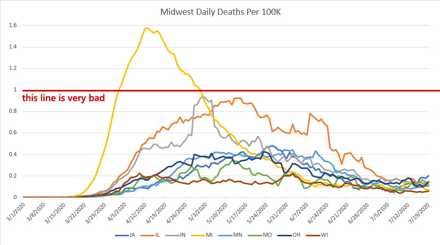
There were two states in the Midwest that got hit pretty badly early on. Michigan and Illinois both saw some fairly intense COVID spread in April and May, likely due to the fact that they both host fairly large and dense cities.
One thing we see here is how the lack of testing early on really hobbled our ability to even know what was going on. From the cases chart, it looks like Illinois had more cases than Michigan, but from the (more reliable) death metric, we can assume that it was largely because we were unable to identity COVID cases in Michigan early on.
For the rest of the midwest, we can see that Indiana struggled early on, but that the region as a whole managed to pull things down. We can see cases falling until late June, when they start to rise again. This could be due to increased testing, but if you call one of these states your home, make sure you watch the percent positive metric carefully. If it starts to rise (above 15% of tests coming back positive is a bad sign), take that as a warning sign.
Mountain States
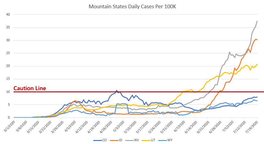
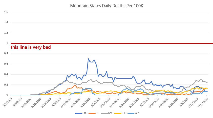
Of the mountain states, Colorado saw the biggest early surge in COVID cases. We can see this in both the cases and deaths metric (though that bump in late April is usually an indication of some kind of data dump from the Colorado Department of Health).
The current surges in Idaho, Nevada, and Utah are concerning. It is encouraging that the death rates remain low, but we should brace ourselves for the possibility of an increase in deaths in those three states in the next few weeks.
First Hit States (Northeast)
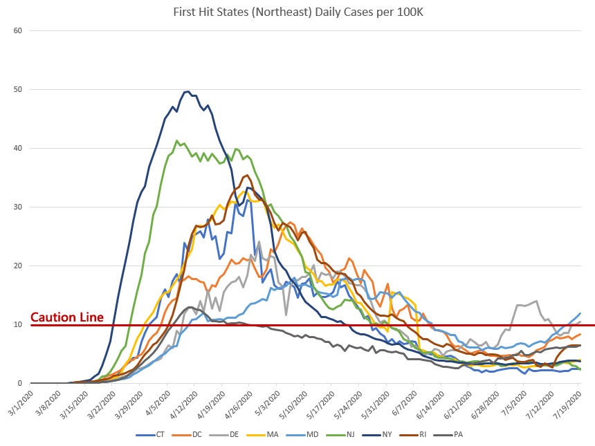
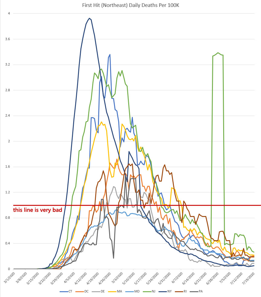
These are the states that bore the brunt of the first crush of this virus. This is the hardest group of states for me to talk about. I want to state clearly and unequivocally that the damage done in these states is not their fault or the result of poor policy. New York City got hit early and that crush spread to the surrounding areas.
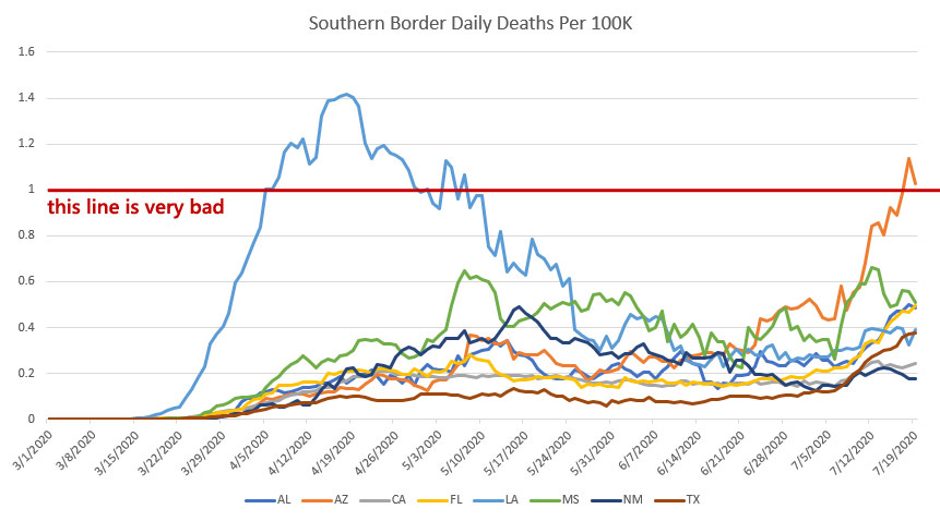
In all the other charts, only 3 states (Michigan, Arizona, Louisiana) go above the “this line is very bad” metric. My sense is that very few people outside of the Northeast understand the true scope of what happened there. Of all the states in this group, only Maryland was able to keep deaths under that “10 deaths per million per day” line.
The northeast got hit fast and hard in a way that it’s very hard to understand if you did not live through it. They have managed to pull both deaths and cases down into a manageable range and for they they should be commended.
Side note: That weird jump in New Jersey’s death data in late June is when NJ decided to add “probable” deaths to their death reporting. In the world of data, weird looking things tend to have very boring explanations.
Southern Border
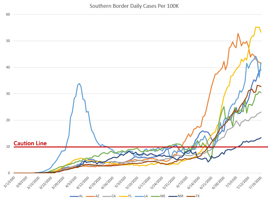
These are the states we are currently talking about because they are the states with the biggest COVID surges.
But cases are somewhat deceptive because we have *much* more testing capability now than we had when this crisis began. We’re able to identify far more cases now than in April.
Even so, we should be concerned. The signs that Arizona is in trouble have been evident for weeks. The good news is that Arizona seems to be past their peak, which means that we can hope that this surge will do far less damage than we feared.
Everyone talks about Texas because it’s huge, but Texas is moving in tandem with Louisiana, Mississippi, and Alabama. Add Florida to this group, though the Florida case numbers are particularly high due to their aggressive and targeted testing.
I’m going to tell you a secret: All the data people are hoping that these 5 states are at their peak. We are all looking at the daily data coming in and there are some signs that these states are at a peak. They might not be. But they might. We’re all holding our breath over this next week and praying to see case reductions.
No one in my data circles says this because offering optimism and then being wrong is how the assholes on Twitter destroy you. This is why the news is constantly dour. There are no consequences for being pessimistic and being wrong. The only time you are attacked is when you offer signs of hope and those signs are false.
That is why this newsletter exists. So I can tell you what we are all seeing and thinking but not saying. We see signs of hope in the southern border states. We’ll see if it holds true.
The Mid-South
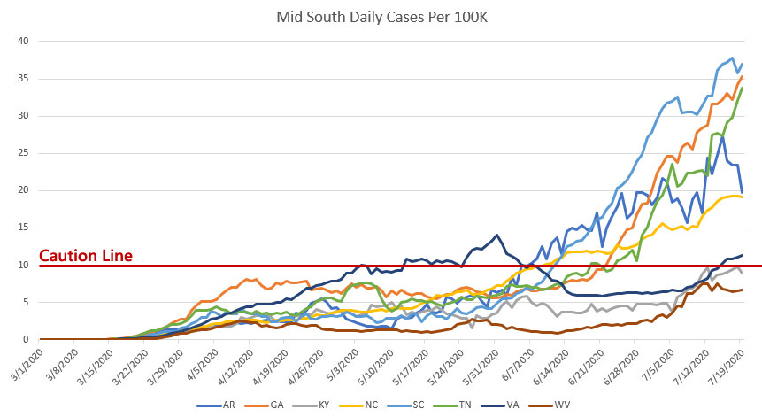
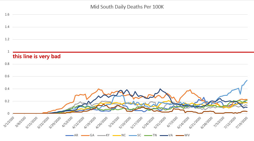
The mid-south is the most interesting area to me because they are close to the southern border states, but there is a strange stratification in their case data.
First, let’s look at the two hardest hit states: Georgia and South Carolina. Both states have recently seen aggressive case increases. These states are the ones I’m watching the closest. It is odd to me that South Carolina’s deaths have increased these last few weeks while Georgia’s have not.
I have no explanation for this. I don’t know why this seems to be happening. I’m simply showing you the data.
Otherwise, I find it strange that the further north you go, the better states seem to do. The worst states are the ones furthest south (Georgia, South Carolina). If you go one notch to the north (Arkansas, Tennessee, North Carolina) things look better. Another notch to the north (Kentucky, Virginia, West Virginia) and things look even better.
I cannot tell you why. I can guess, but I’ve learned that guesses are not evidence. This is simply a thing I find interesting and strange and it leads me to assume an enormous amount of grace and generosity in interpreting how this thing spreads.
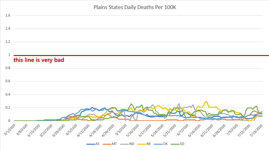
Plain States
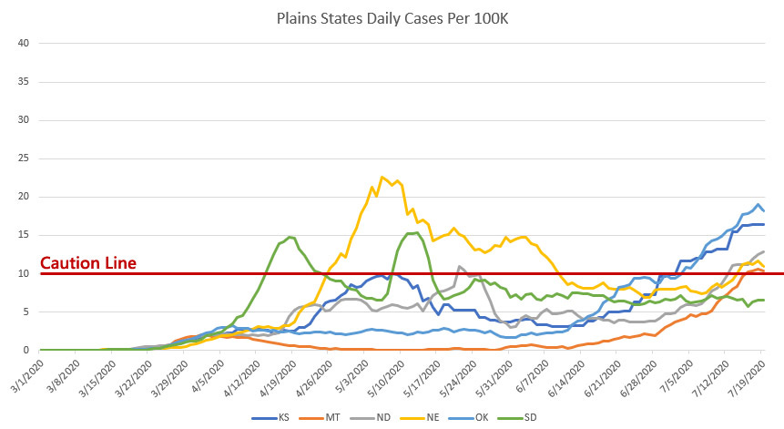
Yeah, Montana is probably a mountain state, shut up.
One of the things I have been most annoyed with is the people who have been claiming that COVID may have started in urban centers but is coming for rural America where there are fewer ICU units and hospital beds and that will spell disaster.
Quite frankly, this does not seem to be the case. Among the Plain states, COVID simply does not seem to have taken a solid hold. Recently cases have gone above the caution line in a few states, but this is most likely due to the small urban centers that these states host. Cases are relatively low and deaths have been thankfully few and far between.
There has been some concern about Oklahoma and Kansas recently, but their increases are not exponential and there is hope that they can pull the infection curve under control reasonably soon.
West Coast
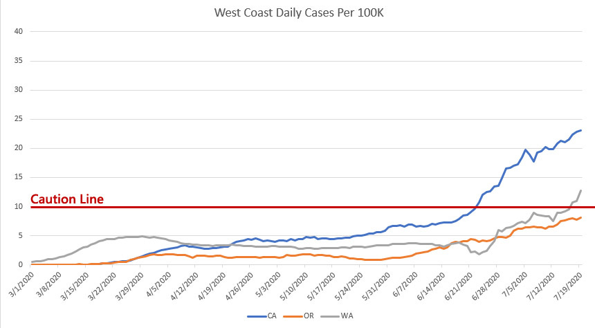
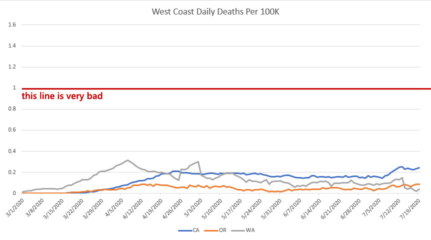
Yes, yes, careful observer, I have included California twice. I added them to “Southern Border” states as well as “West Coast”. The reason is because I suspect that California belongs in both these regions. I think that the southern part of California is more similar to Texas and Arizona while the northern part is more akin to Oregon and Washington.
Even as Washington and California showed up as some of the earliest problem areas for COVID, they have managed to avoid the worst parts of this pandemic. Cases are low and deaths are low.
This may be due to the incredibly strict lock-downs that have been implemented across the western states. It may be due to the mask mandates that are ubiquitous on the west coast. Or it may be due to early intervention in urban areas. For whatever reason, the west coast has seen some of the lowest COVID infection rates outside of…
Upper Northeast + Alaska and Hawaii
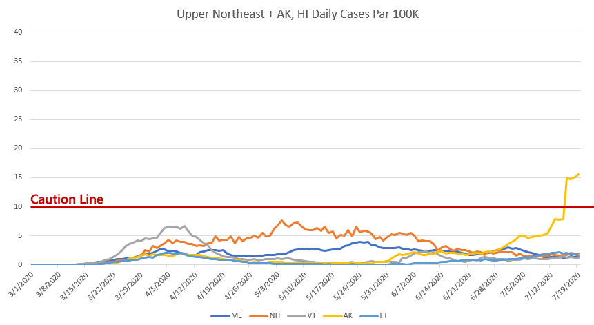
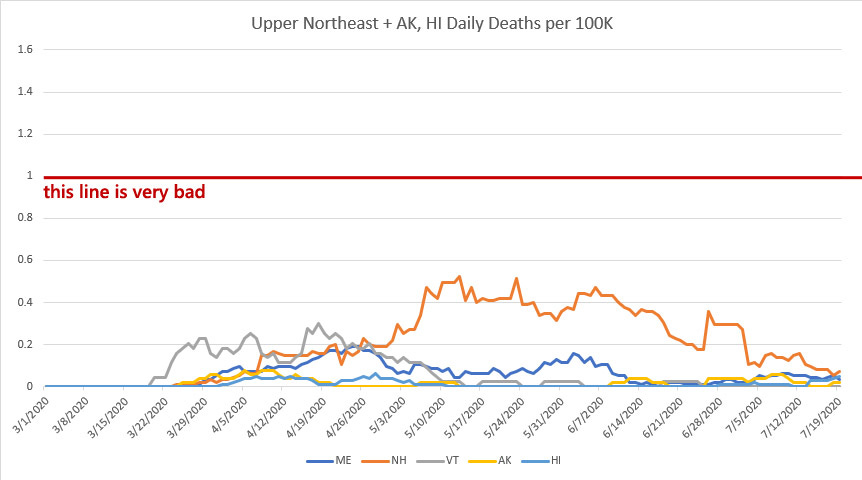
For whatever reason, be it a lack of travel and tourism or careful state policy, these states have managed to avoid the worst impacts of COVID over the last 4 months. They have low case rates and near-zero death rates.
Alaska and Hawaii are clearly able to separate themselves from sources of infection due to the fact that they are isolated regions with solid control and self-governance. But the same goes for Vermont, New Hampshire, and Maine. They are low-density states and while they may not be screening travelers at the border, they likely benefit from the overall drop in mobility as people prefer to stay home over travelling to the rugged and gorgeous regions to the north where all the weirdos live.
Summary
I hope you’ve found this helpful. I hope you found your state and were able to decipher where your area fits in a larger scheme of things.
If this was not as helpful as you hoped, please reach out either in comments or through twitter (I’m found at @politicalmath ) and I’ll do my best to answer every question.
I think we are doing better. I’m hopeful that we are already past the worst of this. But I’m still cautious and careful. I want an informed optimism over a willfully blind optimism.
Disney Shorts: Fall Out, Fall In

World War 2 was hard on the Disney company. Disney had always made a good chunk of money from their international box office (mainly Europe) and WWII essentially locked off half of the world from paying to see the glorious Disney films that were admired by communists and fascists alike.
Disney, ever the patriot, hoped to find relief in making films for the military, but they were a demanding client and not eager to pay for the quality they demanded.
In the end, the Walt Disney Company ended up making a series of films that were meant to resonate with the struggles of the enlisted man (though such a customer had little time or opportunity to watch picture shows).
This is one of those shorts trying desperately to meet people where they are. Donald is a grunt in the army, marching endless miles and enduring the graceless and brutal patterns of army life. It is a rather tender and gently humorous view of army life, perhaps meant to provide relief and comfort to those at home that their loved ones were enduring hardship but there was some joy to be found in it.
I imagine there is some parallel in our current moment though I struggle to put my finger on it.
I like the red line, but I wonder if it's a good idea if it's "somewhat arbitrary." Is it more like "totally" arbitrary or closer to "I made a decision based on some averages and stats that are nebulous but close-ish?" Hospital capacity seemed like a good red line early on give the "flatten the curve" narrative, but that doesn't work state-wide. Big city hospitals can be way overloaded while the rest are quiet, leading the statewide capacity average looking fantastic. God, this data is complicated.
Perhaps I am misreading/misunderstanding, but you write:
"In every chart, I’ve added a red line. For cases, the line is 10 new cases per day per 100K residents. When cases rise above this line, it’s a sign that things *could* go very badly. For deaths, it is at 0.1 deaths per day per 100K residents (one death per million per day)."
It appears that the red line in the death charts is at 1 per 100K (per the y axis and title).