
With Covid, Income > Politics
Covid death rates correlate more closely to income than political alignment, but even that is a simplistic rubric

A few weeks ago, I wrote about the problem with using partisanship as our sticking point with doing Covid analysis. I meant to follow up quickly with this piece, but…

Even so, much of what I’ve been trying to do with this newsletter isn’t necessarily to follow the news, but to try to collect as much information, data, and analysis as possible while it is still easily accessible and meaningful. There is such an incredible wealth of overlooked information and it is important to get the insights out instead of languishing in a forgotten folder on a lonely laptop somewhere.
If you’re just now joining us, the whole kerfuffle started with Nate Silver writing initially that lockdowns probably didn’t impact the Covid death rate, then following up with a piece on how partisanship was more predictive of death rates at a state level than age.
I despise attributing things like this to partisanship (in part because our entire culture is splitting along lines of political partisanship) and talking about Covid killing mostly the Republicans is not only untrue but reinforces an anti-human pattern of grim satisfaction at the death of the other.
I also wanted to run a similar analysis across the county data that I’ve been working with and cultivating and that I used to write my Fallacy of Red Covid in which I dismantled the NYT reporting on red-vs-blue Covid rates.
I decided to split the Covid data into three chunks. The first segment is the pre-vaccine era, which runs from the beginning of the pandemic until March 2021. The second segment is the delta wave, which subsided by November 2021. This hit largely the south and southwest, causing many (including David Leonhardt of the New York Times who popularized the idea of Red Covid) to predict that the Covid was essentially over in blue states… just before the winter Omicron wave (the third segment) hit the entire country.
I did a regression for all the counties in the country (terms and conditions apply, see the end of the newsletter for details) for those three timeframes looking at correlations for Covid deaths as population (urban vs rural), median age, percent of the population over 65, partisanship (what percent voted for Biden in 2020), and median income.
Before we get to the chart, I want to make it as clear as possible: This chart does not tell a complete story. Instead, it is giving hints. It is squeezing causality into metrics that we can measure. Nevertheless, I strongly believe that it shows that focusing on partisanship is one of the least helpful ways of understanding Covid.
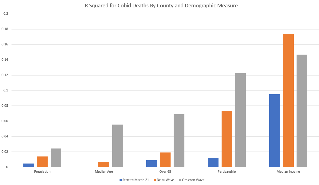
The first observation I would make is that the correlations we see here are *vastly* less predictive than Nate Silver’s state-by-state correlations. Silver’s partisanship correlation was 4-5 times higher on a state level than on a county level. A lot of this has to do with the regional nature of Covid waves, which shows up more prominently on a state level than on a county level.
The second observation is that the most obvious correlation in Covid deaths is not partisanship but income. Income was substantially more predictive than partisanship before the vaccine and then became even more predictive after the vaccine. There was no point in the pandemic in which partisanship was a better indicator of Covid deaths than income.
Simply put: A lot more poor people died of Covid.
Why is that? The narrative around partisanship is that Republicans were less likely to be vaccinated, and so they died at higher rates. But when you look at the actual vaccine rates in heavily partisan regions (not the self-reported rates, but the actual rates as gathered by the CDC) the gaps are small. Poor Democrats died at the same rates as poor Republicans and rich Republicans had similar rates of vaccination to rich Democrats. So why are we talking about partisanship and not income and education?
Our culture has come to view partisanship as a choice but income as an accident of birth. It is therefore permissible to laugh at the suffering of your ideological allies but gauche and ugly to mock the poor. However, what I’ve seen in our cultural moral permission structure is that people look for proxy indicators that allow them to hate the people they already hated.
It makes much more sense to talk about the correlations that are causal and partisanship is (I believe) a proxy indicator for other social and economic realities.
Additional Research
In the interest of writing down all the important things, I’m going to end here with a list of research that has been done by some of my other data friends (all good follows) that deals with the topic of Covid death rate correlations. And then I want to be done with this.
STUMP - Meep on public finance, pensions, mortality and more
The enormously talented Mary Pat Campbell did the hard work of duplicating Silver’s data grab and regression analysis and has a great review of it here. Her main take was similar to mine:
I don’t even know why anybody is going to political affiliation if you can JUST GO TO VAX STATUS TO BEGIN WITH!

You can find Josh Stevenson’s at Relevant Data (highly recommended). He addressed the question of Red Covid in the context of the crude mortality rate and pointed out that all-cause mortality rates in red counties were higher than blue counties *before* the pandemic and those differences persisted almost perfectly across partisan lines even at the height of the pandemic.
At the risk of this analysis turning into another pile-on pointing out the New York Time’s errors, I’d like to offer a more benign explanation. It’s one that has plagued journalists and reports throughout the pandemic. Why is it that everything is framed in Red and Blue? One simple reason: the availability of the data. Leonhardt is using data that is easily accessible and is already formatted for easy analysis.
This is what is called an availability bias. It’s essentially creating a hypothesis or completing a study based on a specific set of data, purely for no other reason than that the data is there. Just because the data is available does not mean it’s the best data to use to try to answer a question.
T Coddington writes at I Numero and did more county-level work on Covid mortality. He came to the same conclusion Mary Pat and I have (the best correlation is simply to look at vaccination rates), but he also pointed out that the correlations were very different region by region. In parts of the country Covid mortality was best predicted by county smoking rates.
I think this is a really good observation b/c it helps inform us that slapping a single narrative on top of this data is blinding people to a lot of helpful insights.
*Terms And Conditions
County level data is extremely messy. The only readily available time series of Covid data that I could find comes from the New York Times. This data set does not include New York City (since NYC has their own health department and reporting guidelines separate from the state of New York, which means we are missing almost 9 million people in our analysis.
This analysis also doesn’t include Alaska since Alaska uses borough and census tracts instead of counties and those don’t have electoral totals so we can’t use them to do partisan analysis.
Finally, the nature of counties in the US is fraught for this kind of work. LA county has over 10 million people in it, almost twice the size of the second largest county. The size of these counties confounds regional differences when trying to reduce correlations down to a small number of variables.
Disney Shorts: Two Gun Mickey

This is early dip into old west tropes at Disney and it goes hard. It’s got the independent prairie girl, the lonely cowboy, the vaguely Hispanic banditos, grand western vistas, the prairie chase, the big canyon gun fight.
Minnie is heading is into town to pick up some cash from the bank whereupon she is accosted and chased by Pegleg Pete and his gang of banditos. Mickey comes to her rescue in a feat of almost Errol Flynn heroism that is so competent that it almost seems unlike Mickey.
This would be a great short to teach examples of early animation and film-making. It’s very well done, with lots of good visual gags and many lovely little touches. It also well structured and well edited. It’s the kind of short that you see from a seasoned and confident team who take joy in their work.