
This Is It! The Final Every State's COVID Numbers in Context (March 2020)

I’ve long maintained that an important component of getting “back to normal” with COVID is simply not to pay any attention to it. Stop the daily COVID tracking, ignore the numbers, take away the ability of the press to make a story out of COVID based on whatever happened in the last week.
This is a strange line for me to take. I am instinctually pro-data: the more the better, the faster we get it, the better off we are. But we’re well past that point now. There is little value gained by watching COVID numbers on a week-by-week basis. Get vaccinated if you can, but after that, this really does need to just be over.
I tried to end this monthly COVID data post in May 2021, but the summer surge became such a narrative football that I felt it was a disservice not to deliver the clean and clear data. In light of so many contextless COVID stories, I felt the need to renew context the only way I knew how.
This time, it is different. The difference is partly because I suspect the press has moved on from COVID, but also I really do want to put this topic mostly in the past. My information gathering patterns have changed so that I permanently have my ear to the ground on a lot of data, medicine, and virology conversations and I’ll still write some about COVID when I think something significant is happening. But as a day-to-day topic, this is coming to an end.
There will be more COVID surges and, if the next summer surge becomes a political football, I’ll be here talking about it because clean data and good analysis are important services. But this is the last nationwide review of COVID numbers.
Animated map of COVID rates per county

Midwest (Iowa, Illinois, Indiana, Michigan, Minnesota, Missouri, Ohio, Wisconsin)
Mountain States (Colorado, Idaho, Nevada, Utah, Wyoming)
Northeast (Connecticut, DC, Delaware, Massachusetts, Maryland, New Jersey, New York, Rhode Island, Pennsylvania)
Southern Border (Alabama, Arizona, Florida, Louisiana, Mississippi, New Mexico, Texas)
Mid-South (Arkansas, Georgia, Kentucky, North Carolina, South Carolina, Tennessee, Virginia, West Virginia)
Plains States (Kansas, Montana, North Dakota, Nebraska, Oklahoma, South Dakota)
West Coast (Washington, Oregon, California)
Upper Northeast + Alaska & Hawaii (Vermont, New Hampshire, Maine, Alaska, Hawaii)
Summary
Midwest


It’s going to be largely the same story all the way down here. We had a huge and short surge in January and then it collapsed. Starting with the midwest is good because it helps us see the real historical weirdness of this surge. The COVID case spike was not met with a corresponding death spike but a general, long-ranging increase in COVID deaths that has spanned about two months.
COVID deaths were down about 16% from this same time last year.
Mountain States

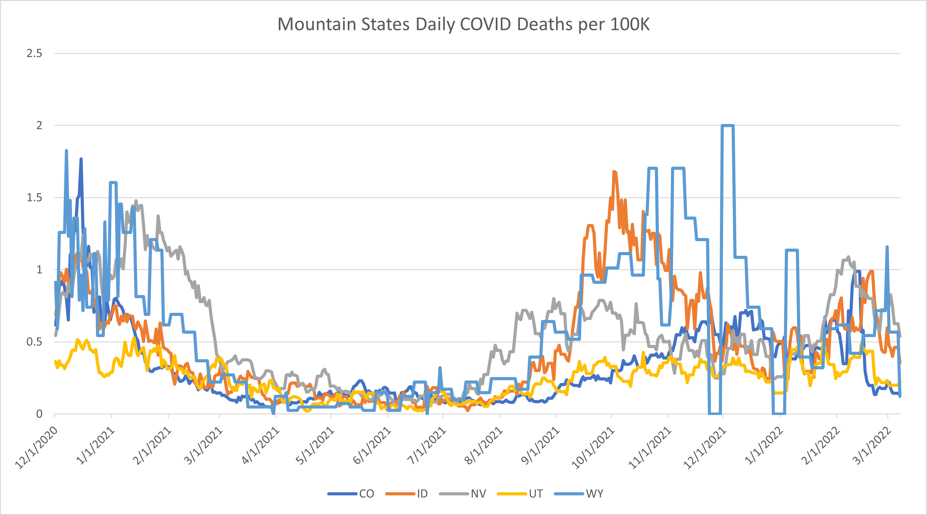
Wyoming’s sporadic death reporting makes this graph somewhat difficult to read, but I’m struck by the fact that the mountain states have a pretty severe spike in cases but nothing that corresponds in terms of deaths. Yes, Nevada saw a low surge, but they have been seeing relatively high COVID deaths relative to their positive rates for the last 5-6 months. If you looked at Utah alone, you would wonder what on earth happened as they had a huge positives spike last month that was barely discernible in their death rates.
COVID deaths are down 14% from the same time period last year.
Northeast
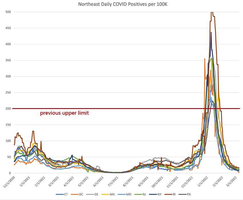

I don’t know how this came to be, but the northeast has ended up as an almost ideal example of regional surges. The youngest region (Washington DC) has been less impacted and the older regions have had a harder time. Overall, despite some of the highest peaks in COVID positives in the country, the northeast has seen COVID deaths this year down by about 25% from the same period last year.
Southern Border
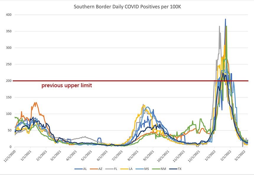

The southern border region had a strange winter because they were coming out of their big summer surge. Armed with that layer of natural immunity, they basically just had two surges back-to-back. Rates were high, but lower than most of the country. The overall death rate was down 40% compared to this time last year.
I almost want to put New Mexico and Arizona into their own category. For whatever reason, they have a unique profile in COVID impact that differentiates them from the Gulf states.
Mid-South


The mid-south states were similar to the southern border states in that they had a summer and winter surge. Tennessee has the same problem as Wyoming in that its reporting is so sporadic, so it makes the graph look incredibly messy.
If I had to guess at the future of COVID in this region (and in the southern border region), I would guess that we’re looking at a summer and winter surge every year. We will see if anyone makes a big deal out of COVID after things calm down this spring.
The overall death rate was down 17% compared to this time last year.
Plains States


The erratic reporting out of Kansas makes the positives graph look worse than it is for the plains states. We’re seeing largely the same thing in the plains states as we see throughout the country: big winter COVID spike, elevated death rate, but lower than last year. COVID deaths in this region were 28% lower than the same time period last year.
West Coast


Despite a COVID positives spike that was 3-6 times higher than anything they had experienced, the states on the west coast saw very little in terms of death spikes. This is great news. California did comparatively, with 60% fewer deaths this year compared to last year. Due largely to their low rates from last year, Washington and Oregon actually saw an increase in COVID deaths year-over-year (47% higher for Oregon and 27% higher for Washington). I’m not entirely sure why that is.
Upper Northeast + Alaska + Hawaii


Alaska is really messing with my system here. It’s a good example of how shoving all these states into a “miscellaneous” category was always going to cause problems.
Alaska had a big fall surge and a big winter surge but the sporadic nature of their death reporting is what is causing the spikes in the deaths chart.
What is so strange and unique about these states is how they were largely untouched by COVID until this year. Yes, New Hampshire and Maine had a winter surge last year, but it was incredibly mild compared to the rest of the country. My suspicion is that the relative isolation of these states was the driving factor in keeping COVID rates and deaths at a minimum, both last year and this year.
Summary
An important component of COVID “being over” is going to be when we start tracking it like other diseases. We shouldn’t have to be watching a day-by-day chart, wondering if we should wear a mask or if we need suddenly start doing a vaccine check to get into restaurants. I tried to lead by example last May but I found that, as long as COVID was big in the news, these monthly checks were a good way to maintain perspective.
If there is a resurgence in COVID news, I’ll write as I feel there is a need. But we’re through the winter surge with no clear indication from the data of where the next surge comes. There will be more surges, but it is well past time to keep such a persistent focus on this particular dataset.
Where's this month's Disney cartoon?
Thank you so much for your work on this. I've viewed these charts and reports as a source of sanity and perspective that seemed not merely lacking, but actively avoided by the media.