
The Case Of The Abandoned Metrics
Changing our metrics to suit our narratives has caused confusion, frustrated the honest, and destroyed public trust

If I can make one claim proudly, it is that I quickly recognized that COVID was a disease that was moving and spreading both regionally and seasonally. The entire reason that I do my monthly data posts in several rough regions of the United States was to demonstrate this fact. It is, in my opinion, impossible to understand COVID by looking at voting patterns or mitigation regimes or by setting two regionally disperse states against each other, especially if we’re looking at metrics within a narrow time window. We have to look at this as a sickness that hits region-by-region and is in line with seasonality changes that drive people indoors.
This summer, as the heat drove people indoors, we saw surges through the southern parts of the United States. As cases grew in these states and the death counts rose, there was an avalanche of seemingly data-focused examples of how these states brought this on themselves while the northern states had, through their policies and superiority, conquered COVID.
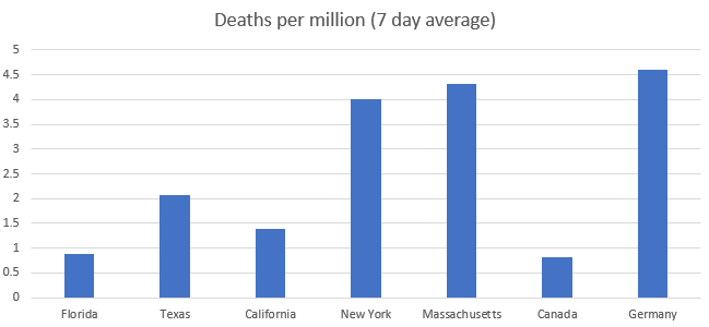
Ostensibly, most of these posts were about vaccines and delivered the implied promise that all COVID problems would be solved with a high enough level of vaccine uptake. For example, as classes returned at Harvard, the low incidence of even asymptomatic COVID was presented as evidence that their approach represented a path out of the pandemic.
This kind of pronouncement was meant to imply that vaccination rates were responsible for low rates of COVID at Harvard, not the fact that Harvard is in a region that was at a COVID nadir last September.
Now that the region is having a COVID outbreak, Harvard has, despite mandatory vaccines (and mandatory boosters), mandatory indoor masking, and ubiquitous testing, announced they are returning to remote classes.
We’ve now done this two years in a row. When a COVID surge hits the southern part of the United States, the charts come out showing that the northern states are not having a surge and we attribute that fact to whatever policy metrics are currently being promoted without mentioning that COVID seems to be surging in a seasonal way. In 2020, the explanation was mask mandates and closed schools. However, when I dug into the details, I found that blue and red states had similar mask usage (the bigger difference was between urban and rural use) and pediatric COVID rates consistently reflected the COVID rates in the community regardless of whether schools were open or closed.
These explanations, then and now, feel like partisanship dressed up in charts. This can be most easily seen in Dr Paul Krugman’s assertion that the COVID surge was a political event and that Republicans were to blame.

The same chart made today looks very different, which is probably why Dr Krugman has not shared it or updated it.
Things that are “impossible to ignore” when Krugman decided to use a single week of data have become incredibly easy for him to ignore when a different week no longer makes his point. A metric is found that supports a narrative; in this case, the narrative of “Republicans are the cause of COVID”. But when that metric doesn’t support the narrative, it is the data that is abandoned, not the narrative. The narrative lives on and the people committed to the narrative will find a different context-less metric that helps them tell the story they were always going to tell regardless of the data.
The Graveyard of Common Knowledge
The long-term problem with these kinds of charts is that they claim to give the reader a certain kind of knowledge. They make claims, implicit or explicit, that readers fold into their mental model of how the pandemic works. But if the metric we’ve relied on to tell us the truth starts telling a different story, we need to hold fast to that metric, not our narrative. By holding fast to a metric we’ve previously relied on, we can start asking questions about it, discovering patterns and trends that will help us better understand the world we live in.
But when we abandon the metric instead of the narrative, we’re admitting that the metric was never about discovery, understanding, or truth. We’re treating data not as a guide but as a rhetorical tool to be abandoned when it is no longer useful.
People end up building these mental models based on the charts and metrics today and expect those models to hold fast and have predictive power. That’s why it is more important to the integrity of the field for data pundits to be consistent in their data presentation than to be constantly promoting the narrative of one side or another.
During the summer and early fall, a Massachusetts statistician posted weekly gifs of COVID rates charted against vaccine rates. He helpfully charted the states with red-blue encoding so we could see how a state voted in the 2020 presidential election.
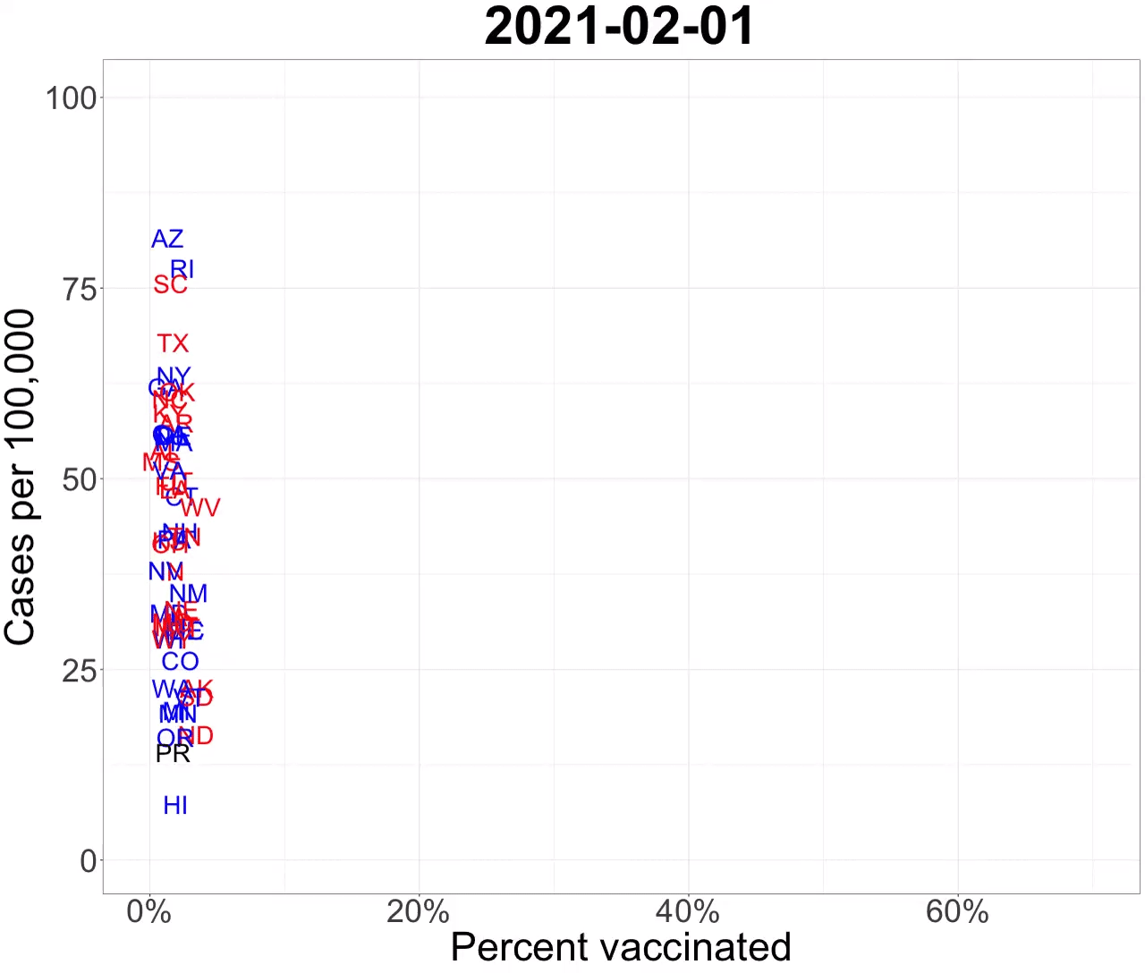
He stopped doing this months ago. I suspect he noticed that the charts were starting to tell a story he didn’t want to tell. If we were to continue looking at his charting metric, his chart now looks like this.

This is the part I didn’t really want to write. First of all, this chart seems to say that vaccine distribution is positively correlated with high rates of COVID. That correlation is misleading, but it is misleading in the same way that the original chart was misleading. Vaccines are protective, yes, but the original chart is really a chart about the region and seasonal surges and it erroneously uses politics and vaccine rates (which are also regional!) as its explanatory thesis. This made readers assume that they knew the truth and the truth was that blue states were immune to COVID surges.
This has caused a lot of frustration and confusion among people who genuinely believed this thesis and believed their own state and region to be free of future COVID dangers. As the entirely predictable winter surge started hitting the states that this chart implied would not be hit, there has been a clear frustration that the expected relief did not come about.
There was an occasional hint of self-awareness, like when a data journalist from The Economist asked why Florida was getting hit so hard despite high vaccine rates.
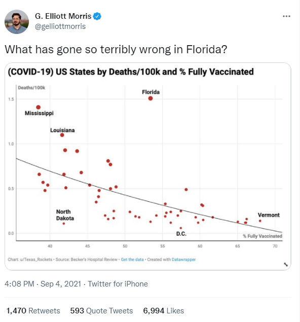
The answer (which is growing tedious with repetition) is that Florida was part of a region that was having a severe COVID surge. The really important question here is “wait, if vaccines rates are as protective at a state population level as these charts imply, why *is* Florida having such high COVID rates?”
This was an important question that was largely ignored. So powerful was the narrative that vaccines would stop all COVID surges in their tracks that there has sprung up a conspiracy theory that the only possible explanation for this is that Florida is faking their vaccine reporting rates. This is nonsense, but it’s evidence of how strongly a narrative belief guides people’s view of the world.
There should have been more questioning, more reflection, more inquiry about why Florida was seeing a surge with a vaccine rate that compared favorably to many northern blue states. These states are currently being hit with COVID surges and are scrambling to manage nearly every aspect of the pandemic.
These are the consequences of misleading data and poor visualizations. These states should have been far more prepared for this winter surge, but the common knowledge from the summer surge was not “even highly vaccinated states can see terrible surges” but “only red states get COVID now”. This misapprehension was entirely avoidable if journalists and data pundits had contextualized the information. They could have prepared people to understand what was happening with COVID and helped align expectations and understand that COVID would very likely circle back toward the northern part of the United States in the winter months.
It didn’t have to be this way. Or maybe it did.
Maybe our dunk-driven information economy means that context isn’t valuable and that partisan dunking drives so many eyeballs and inspires so much short-sighted and inconsistent data journalism that it’s more profitable to be wrong and to give people an inaccurate impression.
I hope that’s not the case but I fear it is. I am worried that this is the foreseeable future for news and punditry: COVID becomes the “default story”. When nothing else is happening, COVID takes over the news cycle. Every summer, when COVID hits the lower half of the country, we get a steady stream of dunks and mockery, reinforced by short-sighted and contextless charts and metrics that imply those states are getting COVID for their partisan crimes. The following winter, when COVID hits the northern half of the country, everyone acts surprised, all those charts and metrics that were popular during the summer are abandoned, and the moral view of COVID tossed aside.
Perhaps the Omicron variant will be mild enough to take the focus off COVID. Perhaps we will come to some kind of social agreement that COVID is endemic, regional, and seasonal and, just as regional flu outbreaks don’t make national news, we can go back to treating it like any other disease.
That is what one private school in Alexandria has decided to do. I think that’s how things should be. I hope they will be soon. But we have to abandon the use of partisan blame-throwing on COVID metrics. We need to help people see this as a cyclical endemic disease and not as an opportunity for partisan attacks. People have an endless appetite for partisan dunks and we still view charts like these as the unbiased arbiters of truth so long as they reinforce our existing prejudices. This can go on for as long as we allow it.
Disney Shorts: Modern Inventions (1937)

There is something really fascinating about Walt Disney and his relationship with technology. His entire company hinged on the fact that he was an obsessive technologist who was constantly experimenting, testing, refining, and improving the technical process of animation (and, with Disneyland, a host of technological innovations). But his stories are often incredibly technophobic, filled with snarky criticisms of industrialization and mechanization.
This is one such Futurama-type view of the “world of the future” as Donald Duck enters a World Fair-style exhibit and fights with nearly all the robotic denizens. There is a hilarious running gag where a robot butler is incessantly trying to relieve Donald of his hat. Another sequence involves Donald getting stuck in a robotic cradle while a voice dotes on him while robotically abusing him.

This short is a gas, hurling from one robotic gag to another. There is no narrative to speak of, just these great jokes where robots are trying to act like humans and failing miserably (always to Donald’s disadvantage).
I think my main frustration the last couple of years has been that one seems to be able to get away with data manipulation murder so long as one doesn't contradict "the narrative"
As soon as one does contradict "the narrative" the information is promptly deplatformed, for reasons as spurious as "not being peer-reviewed" when anyone who actually pays attention to these things knows that things that go against the narrative are scrutinized 100x harder than the analytical pablum spewed regularly by Krugman et al.
It's damn near impossible to know what to believe without devoting a significant chunk of time to the endeavour.
Yeah, Michigan State University, right next to us... oh, what to say. When they created a vaccine mandate last August, I thought, "I'm against this, but I guess at least it's a path to ending their mask mandate". Silly me, they never ended their mask mandate. Now they have a booster mandate too. And now they've moved their January classes online. And the letter from the president announcing the change includes a vague comment about "additional information shared on the vaccine and booster requirements" in the future, which makes me wonder... what is booster #2 mandate coming? I'm not sure what additional information there is to share when you already have a booster mandate. Vaccination requirements to attend sporting events maybe? You got me.