Every State's COVID Numbers in Context, Jan 2022
The positives are sky high but we can find encouragement that the severity of COVID is decreasing
This has been an exhausting month in the world of COVID data tracking. I knew it was going to be bad when I did my December post just before Christmas but I had no idea that this next month was going to look like this. I want to say up front that we have a sense of what is happening and there are some good signs, but we are still very in the middle of this surge, waiting to see how it turns out. Let’s start this month with the bad, the good, and the caveats.
The Bad
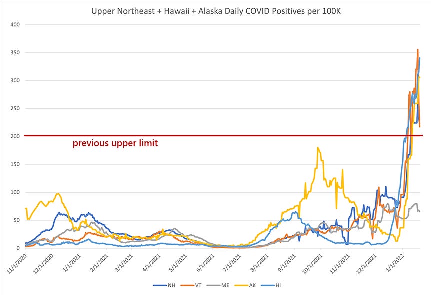
The bad is that I had to reset the y-axis on my charts. This is a very narcissistic way of saying that the COVID positive rates this last month were insanely high. Much higher than anything we’ve seen. So much higher that I felt the need to give a sense of how huge this surge is compared to previous surges. Keep in mind that in my previous charts, my top line of COVID positives was 200 positives per 100K residents because that was the worst of the worst of all the COVID outbreaks in the US to date.
Here is what these recent surges look like in comparison.
From a data standpoint, I don’t know what to do with this information. Keep in mind that, at the beginning of this crisis, the threshold for opening back up was to have 0.7 daily cases per 100K population. For months, I placed my “be careful” line at 10 daily positives per 100K. This is unthinkably higher than that.
I don’t know how I can go back to watching monthly cases when the upper limit for my charts is at 500. “Bad” used to be 60. Everything after “500 daily COVID positives per 100K” is going to look fantastic. What we once considered an incredibly dangerous surge is going to look like a speed bump. That this can happen in states with some of the highest vaccination rates in the country is all incredibly disheartening.
However…
The Good
While I had to completely realign my “COVID positives” charts, I made no changes to the y-axis on my COVID deaths charts. There has not been an crazy death surge that corresponds to this crazy case surge. There are several plausible explanations for this:
Vaccines mean that death rates are much lower
Omicron is simply less lethal
Improved access to testing means higher positives as we catch more marginal and asymptomatic cases
My inclination is to go mainly with #2 and a bit of #1. If vaccines were the deciding factor, we would have seen lower rates of death in Florida this summer. Indeed, even low-vaccination states that are having surges this winter are not seeing the death surges that we would expect if the vaccination rates were the main factor keeping deaths down.
Nevertheless, the death rates are currently nothing like what we would expect. Yes, deaths are elevated, but this is not New York City in April 2020. That is to be celebrated.
The Caveats
The caveat to this is that this newsletter comes at the moment of inflection. If there were to be a massive spike in COVID deaths, we would expect it in the next 7-14 days.
You may notice that Rhode Island has had the highest rate of COVID positives in the nation in the last month, so I decided to use them as an example. They are actually a perfect example because they are also the second most vaccinated state in the country. So I tried to chart their positive rate against their death rate since this pandemic began.
This was all done by just eye-balling things. Through trial and error, I assumed 1 in 70 COVID cases would result in death and then charted the death reporting backwards 18 days. Applying these transformations to the data, we can see positives predict deaths about 3 weeks out.
This was a pretty good match for the surge last winter. What we see now (so far) is that positives are surging but that deaths are not.
This is exceptionally good news. But it’s news I’m reading on pins and needles. Maybe this trend holds. Hopefully it does. We’ll know very soon, but it’s hard to say for certain until it happens.
And so… here is the less-than-helpful January 2022 county COVID map. Maybe I need to re-align my color metric on this one, but I probably won’t. I’m suspicious that the previous “high” level will still be a valuable metric for understanding spread after we get through this terrible winter surge.
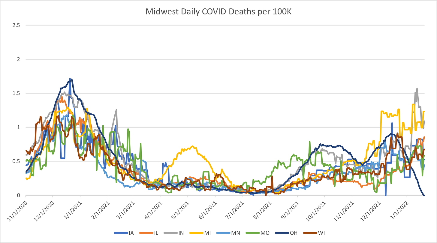
Midwest (Iowa, Illinois, Indiana, Michigan, Minnesota, Missouri, Ohio, Wisconsin)
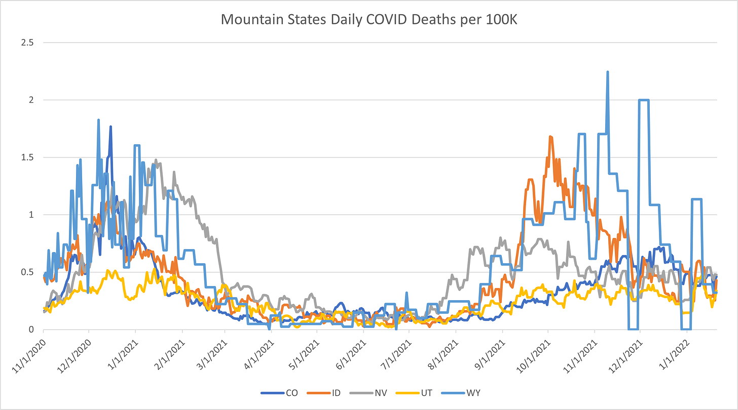
Mountain States (Colorado, Idaho, Nevada, Utah, Wyoming)
Northeast (Connecticut, DC, Delaware, Massachusetts, Maryland, New Jersey, New York, Rhode Island, Pennsylvania)
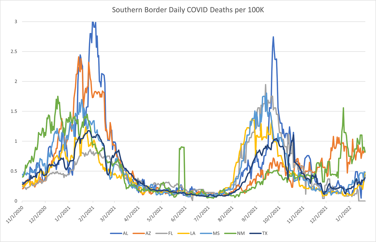
Southern Border (Alabama, Arizona, Florida, Louisiana, Mississippi, New Mexico, Texas)
Mid-South (Arkansas, Georgia, Kentucky, North Carolina, South Carolina, Tennessee, Virginia, West Virginia)
Plains States (Kansas, Montana, North Dakota, Nebraska, Oklahoma, South Dakota)
West Coast (Washington, Oregon, California)
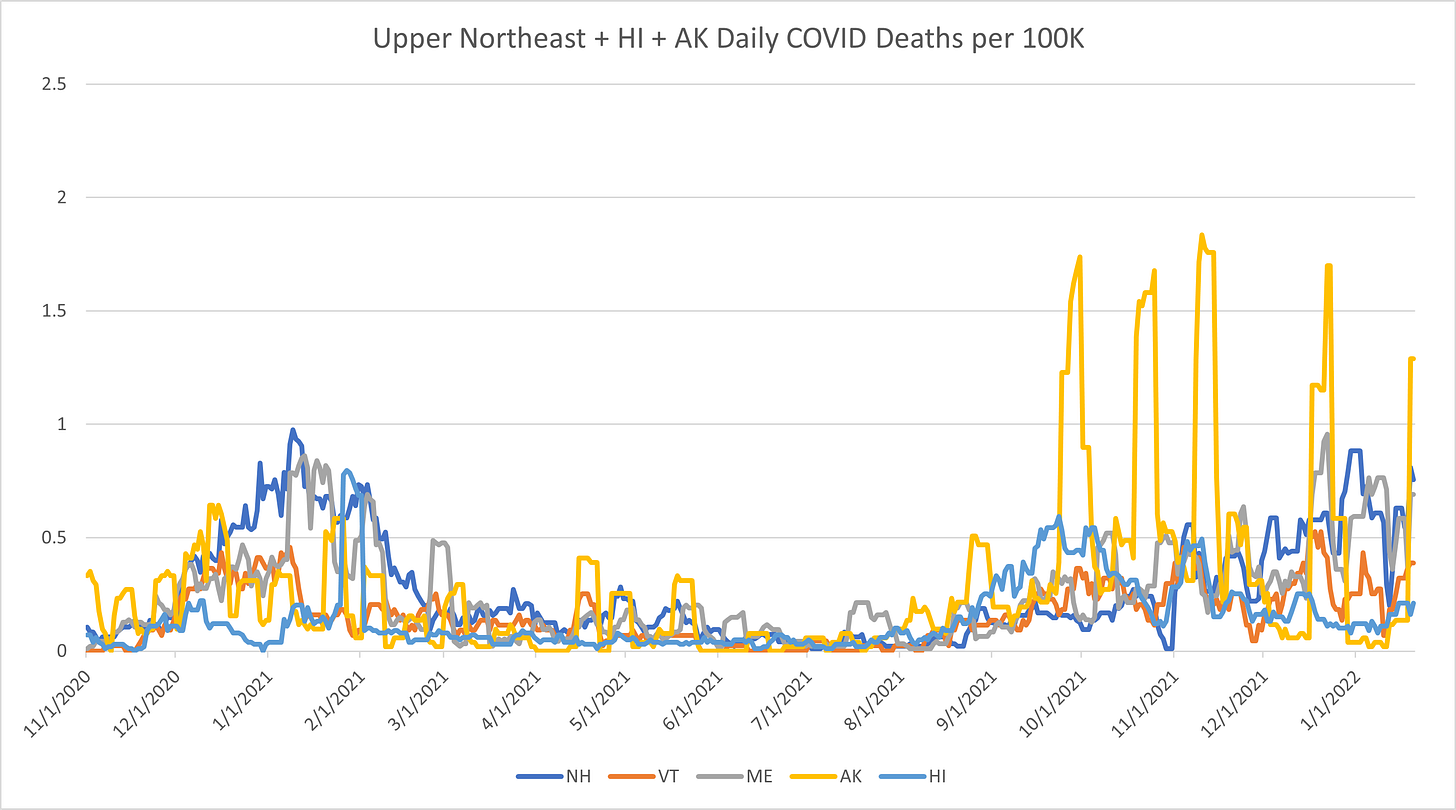
Upper Northeast + Alaska & Hawaii (Vermont, New Hampshire, Maine, Alaska, Hawaii)
Summary
Midwest
The midwest surge is still quite strong and recent, so it’s hard to tell what effect they will have on the death rate. It’s disheartening to see Michigan and Indiana surge in deaths (Michigan has had an absolutely brutal time with this virus), but the other states are only mildly elevated in death rate so far.
I gotta say (and this is going to be a theme in this edition)… I don’t think this is going to last. I think deaths will spike in the next few weeks. The best news here is that the spike is sharp and short, which means that it will likely collapse quickly by mid-February.
Mountain States
The mountain states at this moment is a near-perfect vision of what we’re dealing with right now. Here we have every element of the recent movement of COVID in view. Sudden case surges, lagging deaths, the fact that the worst-hit state in the previous surge is the best one in this surge, it’s all here.
Due to Omicron and the fact that it genuinely seems to be less potent, I’m going to be optimistic here. But I expect that, by this time next month, the current surge will be over and we will have seen the corresponding increase in deaths.
Northeast
I apologize, I simply did not have the heart to extend the y-axis to 600 in order to accommodate the two days where Rhode Island went barely over 500 positives per 100K residents. So I just let it push over the upper limit of my chart.
Let’s focus on the positives here: the Northeast is most certainly on the downslope of this surge. There is a good chance that, after this surge is over, they will be in for a nice uneventful winter and spring. We can only hope.
We can see a death surge now that is similar to what they saw last winter. My suspicion is that it will spike in the next few weeks. But I don’t think it’s going to surpass the surge from last year and that’s good news.
Southern Border
If you’re looking for a fun and confusing region, you can’t do better than the southern border states. Here is what I’m thinking with this region: They started their normal winter COVID surge in New Mexico and Arizona (which is similar to last year). That surge hit with Delta, which is why we can see that surge resulting in higher death rates through December and most of January.
The late-breaking surge is due to Omicron, which is (we think) less dangerous. How much less dangerous is still an open question, but we haven’t seen the case surges manifest as death surges yet. Surely we will by next month, but for now things are still relatively quiet.
Mid South
The mid-south is in much the same place as the southern border region in that they have seen a pretty sharp COVID surge but not a corresponding elevation in deaths. It’s hard to tell from this graph, but it looks like the COVID cases are declining from these states, so we’re in a state of suspended animation waiting for the other shoe to drop.
Plains States
Due to the low population of these states, the data is incredibly spiky. In particular, death data is prone to sharp spikes in week-to-week updates. We can see that the plains region is having the same sharp positive spike that we see elsewhere, but it’s not (yet) as high as the northeast nor is it manifesting in the death data.
I would expect to see some increase in deaths by this time next month. By then, we’ll have a fuller understanding of exactly how potent or benign Omicron is.
West Coast
For whatever reason, COVID has been particularly kind to the west coast. California seems to be on the down-slope of their Omicron surge and, though we don’t see it yet, I expect Oregon and Washington to start trending down in the next week or so.
We’ve not yet seen any death increases in these states, though I suspect we will in the next few weeks. Hopefully, it will be mild. There is no way to know other than to wait.
Upper Northeast + Alaska + Hawaii
I’m sure that there is a good reason why Alaska has these periodic death data drops, but it’s just terrible for my charts. At a guess, I would say that they do a monthly summary of deaths and that is what is causing these weird spikes.
That being said, the upper northwest (and Hawaii and Alaska and every state except Maine) is seeing incredible spikes in COVID positives, but we are not seeing a corresponding spike in deaths. Maybe that is coming, we’ll know next month. But for now, we just have to be patient and wait to see what happens.
Summary
We’re in a weird holding pattern right now. COVID cases are through the roof in just about every state in the country… but deaths have not followed suit.
Yet.
This does not seem to be a factor of vaccine distribution; states with high vaccine uptake are not doing better than states with low vaccine uptake.
Yet.
A lot of these questions will be answered in the next few weeks. Waiting is the hard part. We want the answers now but they simply will not present themselves until all the data comes in. For the time being, we simply need to wait and see what happens. There is excellent reason to believe that these surges will be high on positives and low on deaths. But there is no way to prove that other than simply waiting for the results.
Disney Shorts: The Legend of Cayote Rock (1945)
Usually when a Disney short uses narration, it’s for some storybook style cartoon (like Ferdinand the Bull) and not with one of their core characters (Mickey, Donald, Pluto). This is a particularly odd one because there isn’t necessarily a really compelling reason to have the narration, the short could have worked on its own with a few small changes and no dialogue at all.
This short is pretty good, a light piece with Pluto as a sheepdog defending his flock in Arches National Park from a cayote. It’s fine for what it is, but there are some pieces out of place in it. For one, it’s weird to watch a cartoon short with a cayote where he does not get clobbered. The cayote character is portrayed as clever and vicious, but we cut away from any satisfactory comeuppance he might get. In the end, he is chased away by Pluto but nothing particularly bad happens to him. The visuals are rich, the jokes are ok, but the narrative is spotty.


