Data Journalism Means Asking Questions, Not Just Rendering Charts
I am weary of COVID. This newsletter started out as a clearinghouse on the best COVID data that we had coming out and where to look for good information and where to get the plain clean data.
It’s morphing into this strange whack-a-mole for poorly researched and poorly written data journalism surrounding COVID. I generally love data journalism, but the more of it I’ve seen in the last few months, the less I love it. It’s shifted from “here is an interesting story that we can tell with data” to “I have a story, what data supports it?” That is the opposite of how I’ve tried to approach things with data and every time I see it happening a bug crawls under my skin.
I’ve been very hesitant to talk about data regarding “vaccinated vs unvaccinated” COVID rates from the CDC. My biggest problem with it is that I don’t know how they are counting things and so I can’t be sure if the data is a fair representation of what is actually happening.
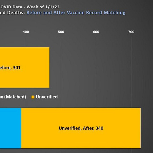
UPDATE: I’ve been informed that the CDC standard for comparing “vaccinated vs unvaccinated” is to lump all “unverified” cases into the “unvaccinated”, which is incredibly problematic when we’re calculating rates (as I mention below).
I have not wanted to talk about this because looking at data from a health department and saying “yeah, that is not correct” is something that feels very conspiratorial. But I don’t think anyone has signed up for this newsletter so that I can keep my reservations entirely to myself, so here we go.
This piece by Philip Bump is an excellent example. In the piece, Bump makes the case that, though Omicron has hit New York City hard, it is mainly just infecting the unvaccinated.
Within the piece, he commits nearly every hair-pulling frustration that I have in data journalism. His “source” is “NYC Health” which gives you no information about how to actually get the data. I hunted down the file he used, it’s here. His charts are poorly labeled, leaving the user to guess at what the metrics mean.
But, most of all, he doesn’t ask any questions about these data points. He seems to assume (as would most readers) that New York City’s health department has perfect knowledge of every citizen’s vaccine status and is tracking every case, hospitalization, and death with perfect precision.
What is happening is that the city is placing every case, hospitalization, and death in which they cannot prove that the patient is vaccinated into the “unvaccinated” bucket, and then calculating rates of the “unknown” cases against the population of “known unvaccinated”. Because the unvaccinated make up such a small percentage of the population (only 15% of adults in the city remain unvaccinated), this inflates the “unvaccinated” rates much higher than they could plausibly be.
[UPDATE] This has been verified by the NYC Health Department and brought to my attention by @Hold2LLC.
Why does this matter when comparing vaccinated vs unvaccinated rates? Because, when we don’t make that distinction, we get a very wrong impression of what is actually happening.


